

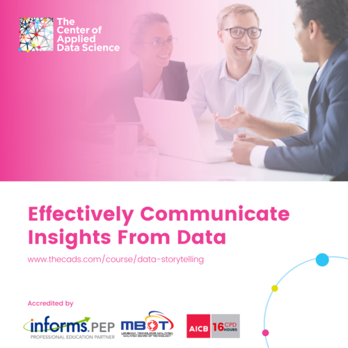
Effective Analytics Storytelling With Impact
Storytelling has been a medium of persuasion since ancient times.
For thousands of years, storytelling has been an integral part of our humanity. Even in the digital age, stories continue to appeal to us just as much as they did to our ancient ancestors. (Source: Forbes)
For several hundred years now, storytelling has proven to be a powerful way of sharing knowledge, insights, ideas, and wisdom. Such a delivery mechanism makes the sharing of information memorable, influential, and persuasive.
For centuries, great storytellers have motivated and influenced actions. This subtle but important difference pays dividends for great data storytellers.
Telling a relevant story supported with credible data and insights will dramatically enhance the chances of your proposal being accepted, as well as the approval of your management and clients.
When hard, cold facts are packaged together with an interesting story, you are bridging the rational and logical side of the brain with the influential, emotional side of the brain. When both sides of the brains are fired up by business insights told using engaging stories, the audience will be more receptive to listening to and understanding your presentation.
People hear statistics, but they feel stories.
Our brains are hardwired for storytelling.
Data professionals with poor data storytelling skills have less impact as the story delivered might not be able to influence decision-making.
Impactful data storytelling delivers actionable insights that drive business decision-making. However, it has to be well-crafted for impactful delivery. Poor data storytelling results in good insights not being valued.
Your story is as important as the data you present.
We all love stories – nursery rhymes, bedtime stories, etc.
A good story secures buy-in from the listener.
Like movies, visuals bring stories to life.
A lack of either one results in a poor experience for your audience.
Communicating hard, cold facts with stories helps people to relate and understand the data contextually is an important skill you should learn.
Great data brings great insights. Great insights can only be delivered effectively with powerful data storytellers.
How a story is told matters.
Structuring your narratives according to your audience needs, along with contextual set up, will help to deliver stories with maximum impact.
Remember, understand your audience.
Cookie-cutter approaches produce poor results; a storyline that does not correlate with another will ruin your efforts.
Relatability is important.
Steps to tell good data stories effectively with visualization.
Here are some practical steps for developing a compelling data story with data visualization:
1. Tell a story that resonates with your target audience. Ensure that your target audience is the hero, and that your offering can solve their problem or become a character in the story.
2. Follow the Storytelling Arc. Form a purposeful story with context, relevant to your audience as the hero, and complete the story with a beginning, middle, and an end.
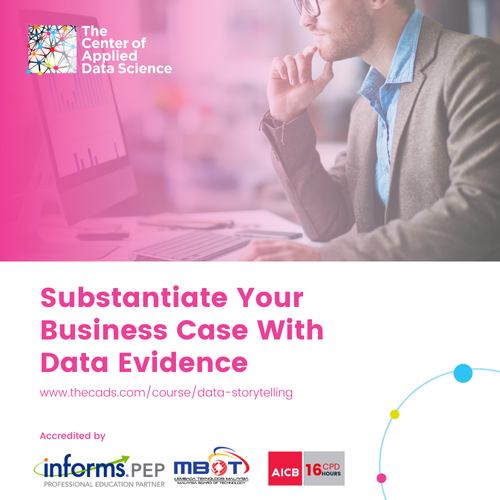
3. Gather data. Start with data collection and carry out market research. Ensure that you gather meaningful data that can be put into perspective for your audience. Good and credible data will enhance your story in a big way.
4. Build the data story. Be creative in crafting your story. Surprise your audience by telling a personal story that is unrelated, but comes with a twist to your main presentation to relate to your audience. Build rapport with your audience by incorporating stories to deliver the data and business insights you found. Also, leave space to allow your audience to explore the data on their own and discover more insights relevant to their roles and scope of work.
5. Decide on your design. How do you showcase your findings to deliver maximum impact? A series of static charts? Animation with numbers and graphics? An infographic? A combination of multiple graphs and tables? A heatmap?
6. Put everything together. Start developing a story with visuals in order to illustrate your insights with purpose. Put in the right context for the points you want to tell. Change and tweak the necessary parts of the diagrams or charts to make the story easy to follow.
Deliver more impact by adding Story Arcs to Your Data Storytelling
Often, management and analysts prefer fundamentally different approaches to storytelling.
Hence it is essential that crafting your story to suit different types of audiences.
The Master storyteller employes the three stages of storytelling.
The three stages of a story include – exposition, climax, and resolution.
The chronological structure mirrors that of the standard knowledge discovery process.
There are also ethical considerations when working with data.
Ensure that you do not jump the gun.
Be sure to have the appropriate data to make the right decisions.
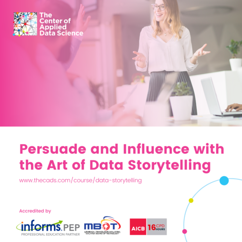
Inspire and influence effectively with data storytelling
Stories add an emotional dimension to your data, while data visualization adds a visual dimension to the story you want to tell.
Download the presentation here to learn:
– How to effectively tell great data story with a visualization
– Key steps to deliver data story to your audience
– What are Data Danger Points and how to avoid them in data storytelling
Click here to download the presentation
Business leaders of the world need to adapt and adopt better data storytelling skills to add more value to data-driven organizations.
Business leaders of the past used to make business decisions based on intuition, gut feelings, and past experiences. The adoption of data-driven decision-making is slow in organizations. For many business executives, crafting a story for a report is time-consuming and deemed unnecessary. A data-driven culture forces business leaders to understand the data presented to them. They need to decipher information that is essential and impactful, which then contributes to business outcomes.
Many organizations have yet to cultivate a data-driven culture. They have not made full use of their data to drive business decision-making. Often, insights and facts presented in the form of charts and tables are not impactful enough to influence decision-making in a complex business environment.
Bring your presentation to the next level with data storytelling
Instead of delivering fact-heavy data presentations and swamp your audiences with multiple charts and tables, inspire and impress your audiences with effective data storytelling.
Enroll in the upcoming Data Storytelling course with an experienced data scientist.

Get a personalized consultation with us on the learning path that works best for you to advance your career.
Visit www.thecads.com/training for more information.